Data everywhere, answers nowhere.
The client’s analytics product could chart anything — which meant every team saw everything, all the time. New users landed on fourteen widgets and bounced; power users exported CSVs because building a view took an afternoon.
The redesign asked a rude question of every pixel: what decision does this help make?
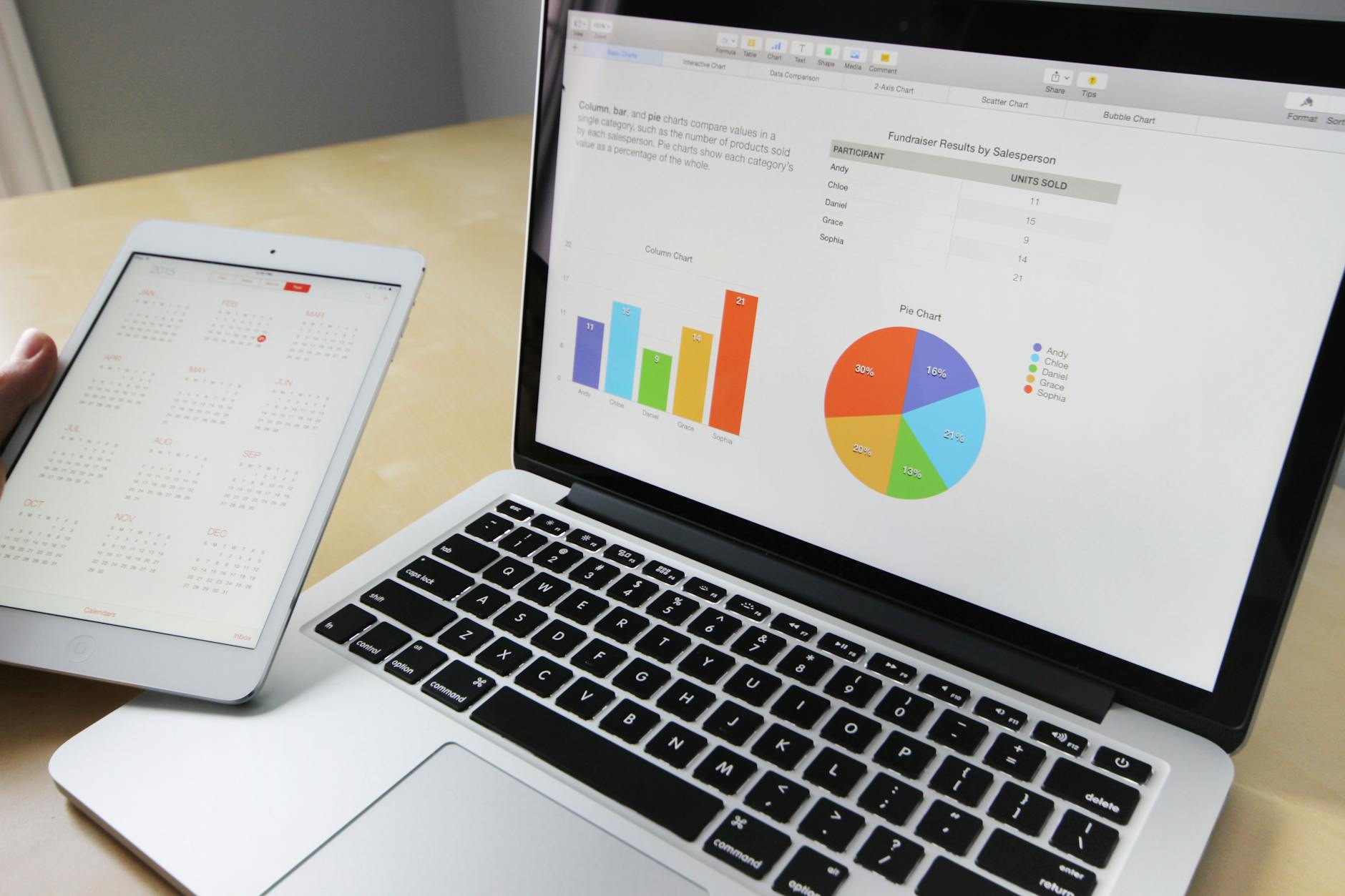
Audit week — cataloguing every widget, filter and dead-end in the old product.

Co-design sessions — sketching view-builder flows with the client’s engineers.
Simple for newcomers, deep for analysts.
Dashboards die two deaths: dumbed-down until experts leave, or powerful until beginners flee. The architecture had to serve a founder glancing at revenue on Monday and an analyst slicing cohorts on Friday — same product, same data.
- Insight cards that explain the “so what” in plain language
- A view builder that composes in minutes, not afternoons
- Scheduled reports anyone — not just admins — can set up
Progressive disclosure, done properly.
The new home shows five things: health at a glance, what changed, what needs attention, and two paths deeper. Everything else lives one deliberate click away. A shared token system (one chart language, one density scale, one empty-state pattern) keeps dozens of views feeling like one product.
Support tickets asking “where do I find…” dropped off within a month of rollout, and the view builder became the most-used feature in the product.
More case studies
Drowning in dashboards?
I turn reporting mazes into products teams actually open every morning.
Start Your Project